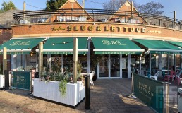
Cocktail Bar Brand for Stonegate Group
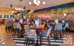
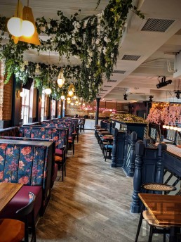
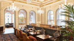
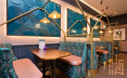
Working closely with Stonegate to evolve the interior aesthetics of their Slug & Lettuce brand identity, it was essential that an expressive use of bold colour, texture, lighting and use of green botanical elements were incorporated into the schemes to enhance one of the UK’s most visually recognisable brand of cocktail bar.
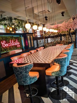
THE BRIEF
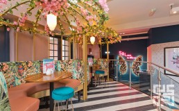
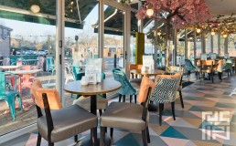
The client wanted the brand to appeal to a wider audience and clientele as it was thought that the interiors had become slightly too female focussed. It was vital that the core DNA of the Slug & Lettuce brand was retained but the new schemes needed to include a much more punchy use of colour, darker tones and material finishes, a balanced mixture of plain and patterned fabrics, creative lighting and a simplified use of botanicals to create venues that focussed on providing a fabulous all day offer to a more diverse range of customer, and provide that all important Instagram moment.
THE DESIGN
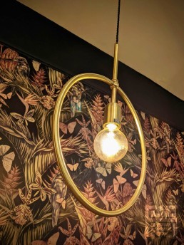
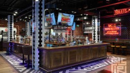
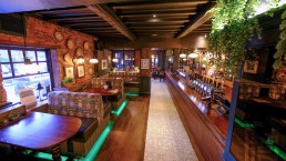
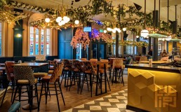
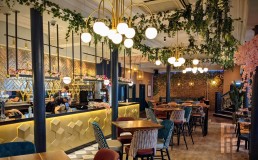
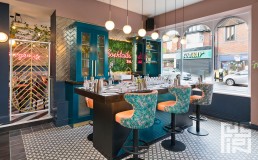
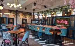
The bar servery is the centrepiece of the interior and acts as a drinks display showcase within every Slug & Lettuce. The new bar incorporates a blend of gold finishes, dark hardwood, metalwork shelving and ambient LED lighting which is adaptable to alter the mood of the servery and highlight the array of products on offer. Other key features of the brand include Birdcage Seating Booths, Cocktail Masterclass, ceiling rafts with trailing botanicals and illuminated butterfly wings, all of which give plenty of opportunity for that perfect selfie!
We have also created some great toilets with a strong use of colour continued through into both the ladies and gents. Tones of pink, gold and grey adorn the ladies whilst the gents benefit from tones of green gold, grey and black. All of which provide the chance for the perfect selfie or group photo, meaning the toilets are certainly worth checking out!